
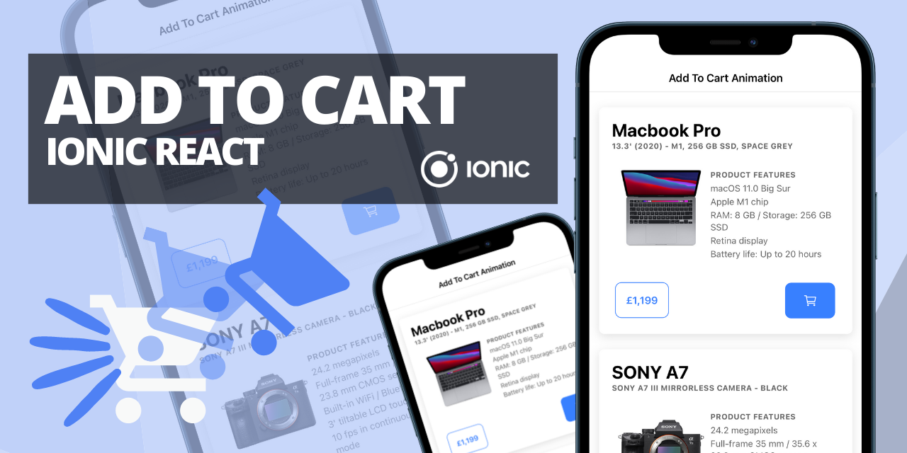
This is a simple and effective way to create an add to cart animated button in Ionic React with Ionic Animations which uses the Web Animations API.
If you're not familiar with either of these, I would definitely take a look at the official Ionic Animations docs and even have a read about the Web Animations API as well before we get started.
The example that I'm going to take you through today is to add a nice visual effect to our mobile application to make it seem as if a cart icon on an Add to Cart button is floating upwards.
There are some benefits of including something like this into an app such as a E-Commerce App or a Food Ordering App;
- Immediately informs the user of interaction
- Visual aid that the item/product has been added to cart
- Improves the user experience (UX)
You could also take the technique and idea used in this example and apply it elsewhere for other effects.
CreateAnimation Component
For this example, we will be using the CreateAnimation component. This is a wrapper-style component imported from @ionic/react and it allows us to wrap another component/element in the animation to apply that animation to it.
import { CreateAnimation } from '@ionic/react';
Properties
This component takes in props in order to build up the style, type and options for the animation. You can see all of the available methods and props here. Today, as part of this example, we are going to focus on a few specific properties;
duration(duration?: number)- Set the duration of the animation in milliseconds.
iterations(iterations: number)- Set the number of times the animation cycle should be played before stopping.
fromTo(property: string, fromValue: any, toValue: any)- Set the start and end styles of the animation. The property being the CSS property, e.g. translate or color.
easing(easing?: string)- Set the easing of the animation in milliseconds. See Easing Effects from the Web Animations API docs for a list of accepted easing values.
We will also be making use of the play() method which is used to Play the animation.
Other ways
There are other ways to use Ionic Animations in Ionic React other than using this wrapper component. However, I will only cover this way in this post. If wanted, you can refer to the docs to see the programmatic approach of attaching an animation to an element and using the createAnimation and addAnimation methods. In my experience and my own opinion though, this is a very clean, effective way of adding animations using Ionic Animations.
Getting started
So now that we've covered the CreateAnimation component and the properties it accepts as well as a brief overview of the properties we are going to focus on, let's get started.
Other components needed
As we are creating a button to "Add to Cart", there are two other obvious components we will need to import into our application, these are the IonButton and IonIcon.
import { CreateAnimation, IonButton, IonIcon } from '@ionic/react';
Icon needed
We can easily import a nice icon from the Ionicons icon library. To keep in context with our example, we can use the Cart icon.
import { cartOutline } from "ionicons/icons";
Hooks needed
We will also make use of React Hooks for this implementation to minimise javascript code and to make our code a lot cleaner and efficient, these are the useRef and useState hooks.
import { useRef, useState } from 'react';
The useState hook will be used to control the display property of the animated icon and the useRef hook we will use to reference the animation component.
Setting everything up
We have everything we need imported now to start into our component. We will be using a functional component in this case, and in my opinion is the best practice. As we are creating a specific button for this use case, we need to give the user the ability to specify a custom click or a callback for after the animation has happened, such as the actual add to cart functionality.
const AddToCartButton = ({ customOnClick = null }) => {

	const animationRef = useRef();
	const [ hidden, setHidden ] = useState(true);
We've now got our component set up with a prop being passed in called customOnClick. This will represent the further functionality that will be executed after the animation as well as the ref and state variables.
Building our animations
With the CreateAnimation wrapper component, we can either specify the properties outlined above directly as props on this component, or define them inside our functional component and later pass them in. In my opinion the latter is cleaner as it gives you more oversight over everything.
First, we need a style to append on to our animated icon, let's call this floatStyle and set it's position and display CSS properties.
const floatStyle = {

	display: hidden ? "none" : "",
	position: "absolute"
};
Next, we will start defining and building our animations with options using the properties I talked about above. We are going to add 2 animations to our icon.
I have split the two animations out into their own objects so it's easier to understand what's going on here, but we merge them later in the fromTo property as you'll see.
In this floatGrowAnimation we are manipulating the transform CSS property of this element and changing the translateY and scale values. This will essentially make our icon move upwards and get slightly bigger.
const floatGrowAnimation = {

	property: "transform",
	fromValue: "translateY(0) scale(1)",
	toValue: "translateY(-55px) scale(1.2)"
};
This colorAnimation is going to change our icon from white to the primary Ionic CSS variable color.
const colorAnimation = {

	property: "color",
	fromValue: "white",
	toValue: "var(--ion-color-primary"
};
Now, we can create our main animation object specifying a duration of 700 milliseconds, 1 iteration, set our easing option and house the 2 animation fromTo objects in the fromTo array.
const mainAnimation = {

	duration: 700,
	iterations: "1",
	fromTo: [ floatGrowAnimation, colorAnimation ],
	easing: "cubic-bezier(0.25, 0.7, 0.25, 0.7)"
};
Click event handler
We also need a function which handles our click event of the main button we are going to build. This function will take care of the icon display property using the state variable, play the animation and execute the customOnClick function that was passed in as a prop if there is any.
const handleClick = async () => {

	setHidden(false);
	await animationRef.current.animation.play();
	setHidden(true);
	customOnClick && customOnClick();
}
So, we're achieving a few things here;
- We set the state variable hidden to false.
- Using the
play()method, we can call it on the animation of the current element attached to our animationRef (which you'll see below in our return). - Hide the icon again, so it's ready for the next animation.
- Execute the customOnClick function is there is one.
Return (rendered components)
This is our final return method with our components.
return (
<div className="button-container">
	<IonButton color="primary" className="custom-button" onClick={ handleClick }>
		<IonIcon icon={ cartOutline } />
	</IonButton>

	<CreateAnimation ref={ animationRef } { ...mainAnimation }>
		<IonIcon icon={ cartOutline } size="large" style={ floatStyle } />
	</CreateAnimation>
</div>
);
Wrapped in the CreateAnimation component is a second IonIcon component which will serve as our animated icon, outside of the button, to make it appear as if it's floating and animating away from the button. We've spread our mainAnimation object passing it's properties as props.
And that's pretty much it! You'll see I've applied some custom classes above to the containing div and the button, feel free to play around with your own, depending on your preference or you can check out the Github repo below for my implementation!
Here is a link to my implementation of this specific component in an Ionic App.
If this has helped you understand Ionic Animations a little bit, or the CreateAnimation component, or if you've implemented this add to cart button into your own app then let me know! Feel free to reach out on Twitter.
I look forward to the next one 🎉.